We’ve designed and developed multiple websites over the years. One of the most key parts of creating a website is designing the navigation menu. A navigation menu is essentially the roadmap for a website, guiding users to the different pages and sections of the site. It’s also indicative of what the business believes in. What they pay attention to, what is important for them, what kind of language they want to use, and what they want their viewers to do next.
One of our larger obstacles, when designing a new website or revamping an old one, is when clients ask us to overload menu bars thinking that it is important to pack everything in the header, from the About to the latest ‘important’ PDF that users should find easily. Usually it doesn’t take much convincing for them to understand that it’s not the right approach, especially when you have an attention time-deficit to guide your viewer to the next step. The web designer has to focus on several key elements to ensure that the header and menu will be effective and user-friendly. Ultimately when designing the header and the navigation menu for an informational website or an e-commerce website, it is important to include key elements that can help users navigate the site, find what they’re looking for, and ultimately make a purchase or take a call-to-action.
Laying Out Your Website Header
Headers can be simple or more complex depending on the kind of business, with e-shops often having to arrange a lot of elements. Whether you’re building a simple brand website, or an e-commerce site, or anything in between, consider breaking down your header in two or three horizontal sections:
a. A top bar — which we love and has helped us many times navigate element placement: For e-commerce websites the top bar can be used for information like store address if you want people to be able to visit, a customer support telephone, and even a login area for your wholesale clients or partners. For informational websites this could be a great place for announcements like an upcoming event, a product launch, or a news ticker.
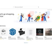
b. Main section: This will include your brand information like logo, maybe a moto, and if your site is a one-pager or you don’t have a lot of content this could also be the place for your navigation menu. If you do have a lot of information or an e-shop it’s a great place to add a search bar. An easy-to-use search bar can help users find specific products they’re looking for without having to navigate through multiple pages. On the right side you may have your cart icon, if it’s an e-shop, or a sign-up button, in the case of a service like a software product.
c. Navigation menu: A third section is much more common for e-shops or large websites with a lot of information. IMPORTANT… don’t over pack it and make wise use of sub-menus or mega menus as they’re called, lately.
Never Ignore the Importance of the Footer
The footer is a great place to add key information that should not be in the header, like navigation to website sections, the newsletter, and the … About section. The About section usually contains information about the company or organization, which is not necessarily as important as the main navigation elements that should be included in the header. There is no clear evidence to support one location over the other, but ultimately, the placement of the About section will depend on the goals of the website and the needs of the target audience. If the main goal of the website is to sell products or services, it is more appropriate to include the About section in the footer.
We suggest that for each element that is being considered for the header, ask yourself whether it might not be so important for it to go in the header and alternatively should be included in the footer. After all, footers can be quite long, should be very informative with a lot of links, and they’re almost always available on every single page.

The Menu: A Roadmap to User-Friendly Web Design
It is important to keep the menu simple, clear, and concise. Avoid overwhelming users with too many options, and only include the necessary items. Remember, you want them to choose one thing and do it easily, and hopefully towards the right direction that will lead to a sale or contact form. Use familiar terminology that your target audience will understand. Avoid using industry-specific jargon that may confuse your users. Organize the menu items logically, with the most important items listed first. Consider grouping similar items together and avoid having too many sub-menus. Also, you might not need a HOME item, especially if you don’t have a lot of space in your navigation menu. The logo always links to Home.
Use descriptive labels for each menu item so users know exactly what they’re clicking on. Make sure the navigation menu is visible and easily accessible from all pages on the website. Use visual cues, icons or vector images to help users quickly find what they’re looking for. Use hover or click effects to show which menu item is being selected.
Menu Engineering: Crafting a User-Friendly Menu for Mobiles
It is important to use responsive design to ensure that the navigation menu is optimized for all screen sizes, including desktops, laptops, tablets, and mobile devices. Use simplified versions of your menu for mobile users. You don’t want users scrolling a menu longer than their screen height. Help them navigate to content built for mobiles. Avoid animations, icons and images that hinder navigation in small screens.
Test and refine the navigation menu with real users to ensure that it is easy to use and understand. Listen to feedback and consider making it as simple as possible.
In conclusion, designing a header and navigation menu for a website is an essential task for any web design but it is also important for the business owner to understand why it’s important and what key elements have to be included. The ultimate goal is to create a user-friendly and effective header/navigation menu that will improve the overall user experience of the website. Keep in mind that tools like heat maps, analytics, and A/B testing can further improve the design, based on real-user data, but that’s a topic for another article…
Keep on reading...

Maximizing ROAS Through Measurable Marketing: A Guide for Small Business Owners
Maximizing ROAS through measurable marketing is not just about spending more but spending smarter. By avoiding common mistakes, debunking myths,

Riding the Pros and Cons of Integrating ERP Systems with E-commerce Platforms
ERP e-commerce integration refers to the process of connecting an e-commerce platform (e.g. WooCommerce) with an ERP system. This allows


