


Websites are far from that conventional trade model. First of all they are porous, a potential customer could ‘come in’ from any webpage; and second, there is no sales assistant to pitch a product’s merits. It’s these preconceived notions that have to be converted into a website that actually sells, whether that is a large number of tangible products, for eg. a shoe store, or a single service, like a plumber’s trade. So, how do you initially draw customers and most importantly, after you’ve spent time and effort to draw them to your website, engage them by creating a fascinating user journey, and finally sell them your brand or products?
Web developer vs Marketing expert
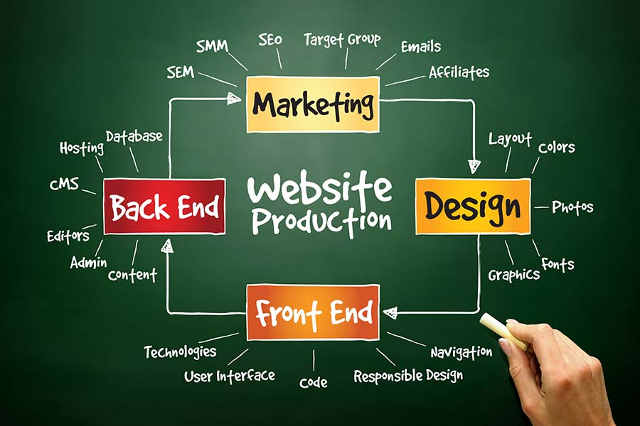
Using a web developer to create your new website does not mean it will be a success at selling your products or services, as you might have hoped for. A web developer should follow an experienced -in websites- marketing professional’s guidelines. While a front-end web developer is an expert on coding a well functioning website, they are not experts on what works best for selling through your website. It’s the same for e-commerce websites, too. Even brand websites have to fulfil a very specific need… the promotion of the brand. A marketing person is responsible for the strategy of how to best sell the company’s products or services on a website. Among other things that includes guiding with messaging, placement, design, content creation, SEO, call-to-actions, functionality, customer journey, monitoring analytics, and many other details before, during, and after a website is built.
Many small companies often choose to skip hiring a marketing expert and dive deep into building a website “just so it’s there” postponing good practices for the future… which usually means lost budget and time. Even if you don’t want to hire a marketing person, you should sit down with someone who has some knowledge and make a plan on paper. Show it to others in the company, work on it more, come back to it a week later and see if you still like it before you start creating it. And even then… start with a digital mock up. Mock ups are great tools as they help everyone, including the web developer, visualise what you’re building. After all, you would never build a house without an architectural or engineering design on paper first…
Starting with the Marketing Basics for Websites
A business website is not just a url and a bunch of coded files magically transformed into a colourful brochure that visitors see in their browser. It is a powerful interactive tool that helps you present your brand to the public, promote your ethics, products and services and last but not least, generate leads. Having a website that looks good and clearly communicates quality information to your consumers is extremely important to your business. A good website has to be user friendly, full of useful information, function correctly and look pleasant and memorable.
Learning to recognise bad website design is essential for building and maintaining a successful online presence. Our recommendations are for all types of websites, regardless of domain or functionality (e-shop, service or brand promotion website).
What to avoid
- Poor use of language, spelling mistakes
- Low quality visual material; low resolution images or distorted logos. Make sure you acquire good photos…they’re your first point of sale
- Awful user experience; no clear way to navigate back and forth between products or pages
- Non-licensed material, like images downloaded randomly from the Internet (that don’t actually belong to the brand). This practice can get you into legal trouble. It’s better to use stock photography or properly licensed free-stock than download pics that don’t belong to you. That’s stealing.
- Minimal text information about the products or services
- Non-proportionate use of fonts; heavy use of uppercase headers that are ‘shouting’ to users
- Outdated or broken landing pages
- Web pages with no call-to-action
- Search functionality with low quality results, especially in e-commerce sites or product catalogs
- External links that drive the visitor away; they ought to open in new Tab/Window
- No GDPR, terms and conditions, privacy, or security information
- Low page speed, not optimised for mobile devices
- Useless 404 page with no functionality helping the visitor find his way to the desired content page
While our list of things to avoid is in no way exhaustive it is a good starting place. Head over to our How to Avoid Bad Website Design for some more useful tips. I suggest you do that after you finish reading this post on what to pay attention to…
What to pay attention to
Build, Design, Layout, Texts
The visual part of your website is what registers with your visitors first.
HOME PAGE
– Your home page has to be pleasant, memorable (not always easy), complimentary to your text information. Good photos in the background or illustrations that compliment the texts is very important as people look at images first before they read
– Consider making more than one home page and A/B testing which works better. Use Google’s Optimize (will be replaced by GA4 after September 30th) or a plugin like Nelio for WordPress
– Update your home page often. We would recommend monthly. A month is enough time to audit what works best for your business and create something new and fresh. You will always have returning visitors you need to keep engaged
– The texts/fonts have to be clear and weighted according to significance and what you want to prioritise
OTHER PAGES
Think of every single page, beyond your home page, as a potential landing page. Users might get there starting from your home page but they might land there directly from a search on Google or some other search engine. Obviously, you don’t want them leaving too soon. Think how you will entice them to learn more about your company and even keep clicking on your site. If it’s a webpage that explicitly talks about your product you might want to include a CTA, in between the text, to sign up to your newsletter or a form urging them to ask for a demo. If it’s a blog post that talks about the industry, you might want to include a few lines in between explaining how your company and products contribute to the industry or suggest more articles for people to read before they click away. Don’t wait till the end of the article to do that; put them in the middle of the text flow but in a clear differentiating way not to confuse people, and don’t overdo it with many examples; one suggestion is fine. It’s easy for a small company to include suggestions that are relevant to the content in the existing blog post.
NAVIGATION
Do not pack your navigation menu with too many links; keep it simple, focusing on the most important things. The About can go in the Footer. We’re also seeing many services companies moving Pricing to the footer, focusing on letting the user discover more about the service or even sign-up before looking at prices. When there is a free version of a service, or you want a user to commit, this is a good policy as it allows the user to focus on the merits of the brand and not the pricing, which could initially be prohibitable. If the user is intent on finding out Pricing, which means they are much closer to actually purchasing, they will go into the trouble of finding the information in your footer.
FOOTER
– Experienced users head for the footer when looking for specific information. Your website footer should be well organised with all the possible information someone may need. That means including the navigation items in your header but also all those extra items like About, Pricing, social media or legal docs, search field or newsletter sign up.
– Site maps used to be a great tool at the start of the WWW and unfortunately have now been abandoned. If you have a lot of useful content, make sure to include one. Also, including links to past newsletters is a great way to have even more content even if they exist in a different website, like Mailchimp.
LANDING PAGES
TEXTS, FONTS, IMAGES
– Build a design guide, even if it’s rudimentary, before you start developing your website. What colours will you use, fonts, and how will you treat your logo… will it appear in black? White? Only coloured, and if so what happens with a background that doesn’t help it pop out? A good design guide will help everyone avoid surprises.
– Use professional copywriters to write your texts; it’s worth the cost. Whether it’s the messaging, a product description, a blog post or an article… use a professional.
– Never use images that don’t belong to you, even if you think no one will notice a photo you downloaded from the Internet. If the images or logos belong to a business partner, always ask for permission in writing.
Learn from Others
– Analyse competitors’ websites and write what you like or don’t like
– Analyse established high traffic websites. Usually these belong to large brands that have the resources and people to do a lot of A/B testing. Considering their layouts, designs, and functionality while adapting them to your needs is a clever idea for brands to design on a shoestring budget.
– If you have strong opinions on design or disagree with other team members, A/B testing and analytics monitoring is the best way to know what works. Use events in Google Analytics or Hotjar or whatever else you use to see how people use your website. Monitor events like 404 (page not found) and scroll (how much users scroll down) to see what is working and what is not. Be continuously on top of your website and improve it by keeping what works and changing what doesn’t work.
– Call-to-action (CTAs) are VERY important and should be everywhere on your site. Even the text on buttons calling for an action is important. According to A/B tests we’ve run, having a button that says GET STARTED versus SIGN UP has proven to be 8 times more effective. Placement of such a button is also important. You’d think that putting it in your navigation top right hand corner would be effective but we can attest that putting it in your hero area, smack in the middle, often is more effective.
Keep on reading...

Maximizing ROAS Through Measurable Marketing: A Guide for Small Business Owners
Maximizing ROAS through measurable marketing is not just about spending more but spending smarter. By avoiding common mistakes, debunking myths,

Riding the Pros and Cons of Integrating ERP Systems with E-commerce Platforms
ERP e-commerce integration refers to the process of connecting an e-commerce platform (e.g. WooCommerce) with an ERP system. This allows